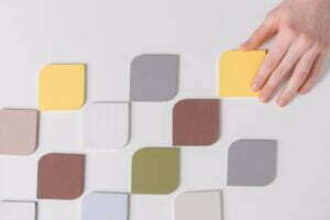
In 2021, the colour trends you are going to see will largely feel calming and uplifting. We’re not going to see a surge of neons or crazy contrasts.
Instead, the upcoming color trends are softer, richer and feel like they were picked for humans, not for computers – with a smooth refreshing edge. The past year pushed us to reconnect with our humanity, and in 2021, we’ll see that connection play out visually.
Colours inform how the viewer should start to feel. So from a branding perspective, they should represent the purpose and personality of a product or brand. For example, the colour blue is perceived as reliable and trustworthy, making it a popular choice for corporate businesses.
1. Neutral tones
In 2021, brands and designers are going back to basics with a more neutral approach to colours. In 2021, designs will instead work within the colour range of our organic rainbow, frequently making slight neutrals the star of their ranges.
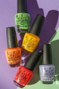
2. Super-saturated, juicy colours
These deliciously juicy and rich colours have a rejuvenating and uplifting effect. They are warm, but not hot. Refreshing, not brash. And the combination of pale pinks and creamy tones creates an intriguing contrast that just works.
In these designs, the pale background is as important as the focal colour, grounding it and making it pop.
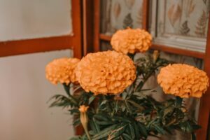
3. Marigold #FDAC53
Marigold is the ideal colour choice for customer-facing brands that want to emphasize their caring brand message and personality. Marigold is also likely to be popular in branding for children’s centred brands and products, thanks to its youthful and gender-neutral qualities.
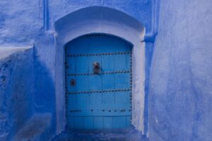
4. French Blue #0072B5
Another Pantone 2021 prediction, this shade is a close relative of cobalt blue. But, where cobalt is striking and electrifying, French Blue feels more homely and nostalgic – with a refreshing take on a darker blue alternative we have been seeing gracing walls recently.
As Pantone themselves put it, it’s “a stirring blue hue that awakens a vision of Paris in the springtime.”
5. Harmonious palettes
In 2021, people strive for harmony in all aspects of their life. We will grasp the comfort that comes from unity and togetherness, leading to the expansion into the colour trends of new designs.
One of the upcoming colour trends we’ll see a lot of is analogous color palettes; palettes that easily blend into each other.
6. Surreal and expressionist colour
Adding to the list of harmonious, feel-good color trends we’ll see in 2021, we will be seeing a lot of designs that use colours in unexpected, even surreal ways to create dream-like images.
These designs make a statement by colouring objects in hues they normally are not associated with. The goal here is to be playful and create escapist landscapes where people can find a few moments of solace away from our challenging reality.
7. Pantone’s Ultimate Gray & Illuminatin
This combination is the colour of the year for Pantone. On one hand, Ultimate Gray feels solid, impenetrable and bleak. On the other, we have the lighter, hopeful and current Illuminating yellow.
Bring these two together and you can recognise a warm resilience in Pantone’s colour choice. A fitting combination that we’re sure to see a lot of in the remainder of the year.
8. Worn and faded
This theme presents long faded colours with stress lines – reflecting the past year and the struggles we have faced and developed with over time. Designers are capturing the acceptance of our past and embracing these changes into a new and innovative future.
There is much more to this trend than distressing colours to make them look well-loved – designers are also using rough, frayed textures to make objects and images seem like they have stood the test of time.
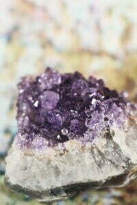
9. Amethyst Orchard #926AA6
Amethyst Orchard straddles the line between regal elegance and floral femininity. This makes it a great fit for brands with a more exclusive or luxury feel. It also works well in graphics for sentimental personal events, such as weddings and baby shower invitations.
The trend feels like an awakening into a frest start – and will likely continue to develop throughout coming months, so expect to see more.
These colours will build the base for a new start, going into the next year with high hopes for a more positive and human centred approach which we can all relate to more easily. You will surely see more of these colours throughout the market and within new designs.


